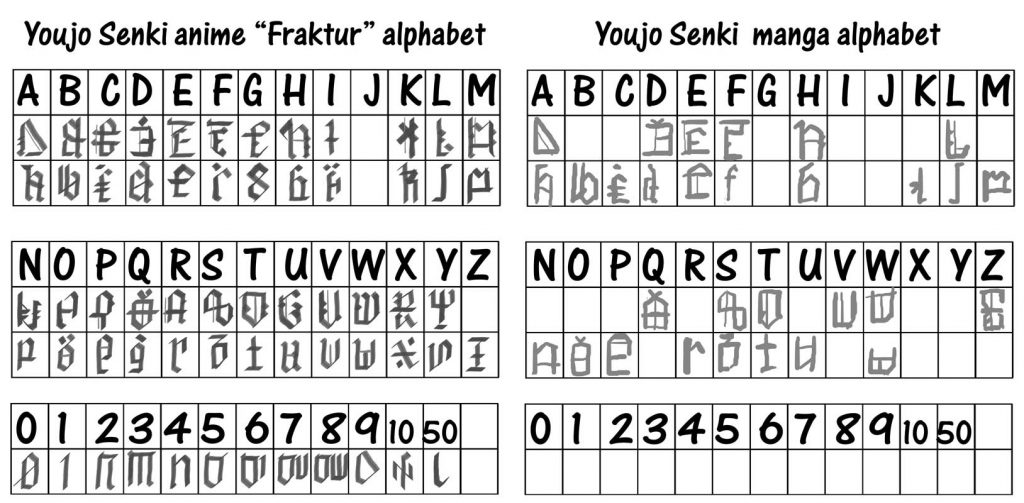
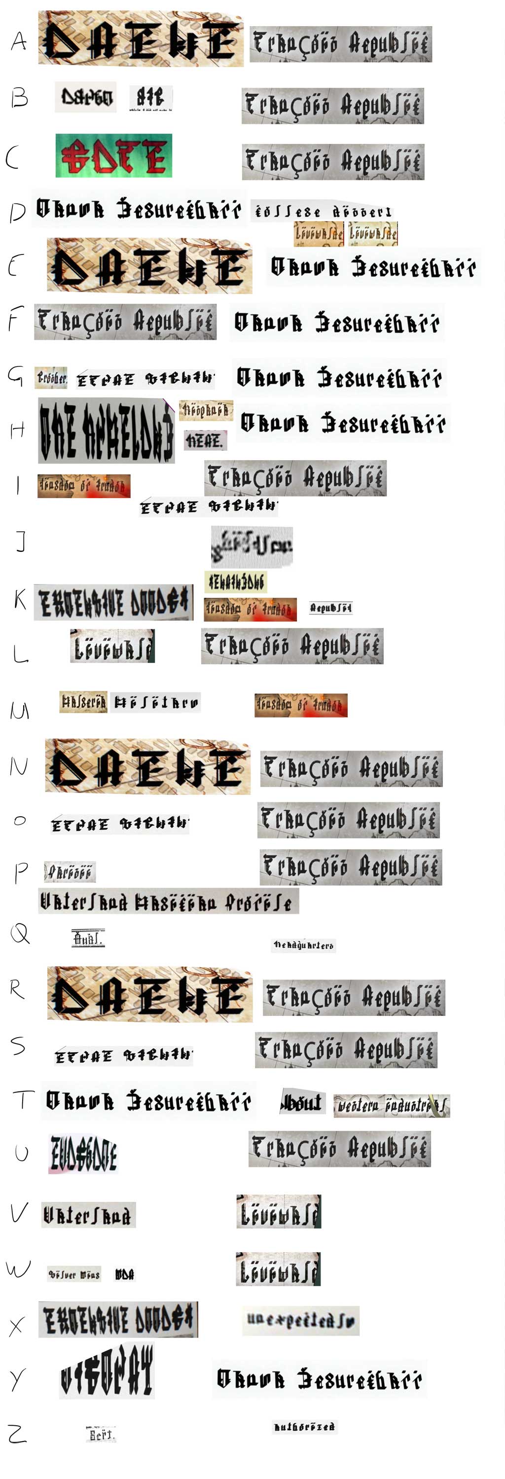
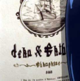
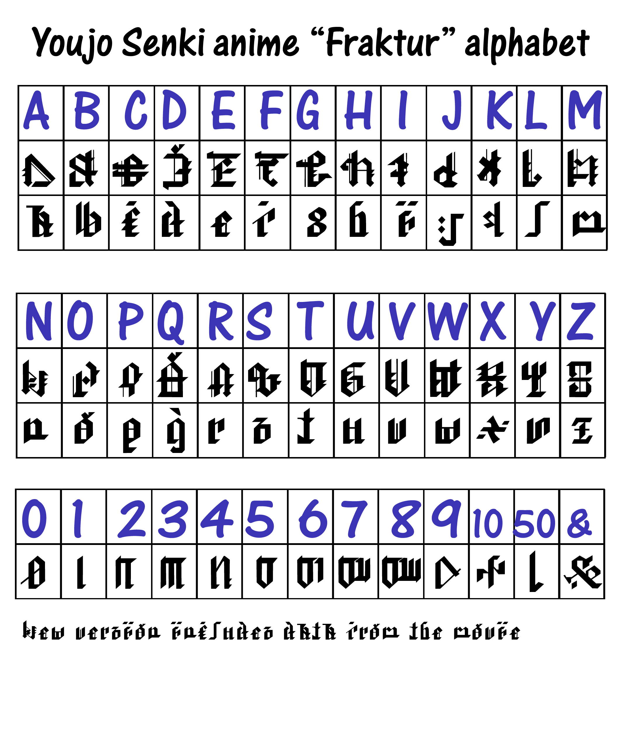
There has been no official character set released, not even in the art book, so I made my own mapping tables. There are two main fonts; the “print” style used for handwriting and forms, and the “Fraktur” style used in newspaper and some documents.
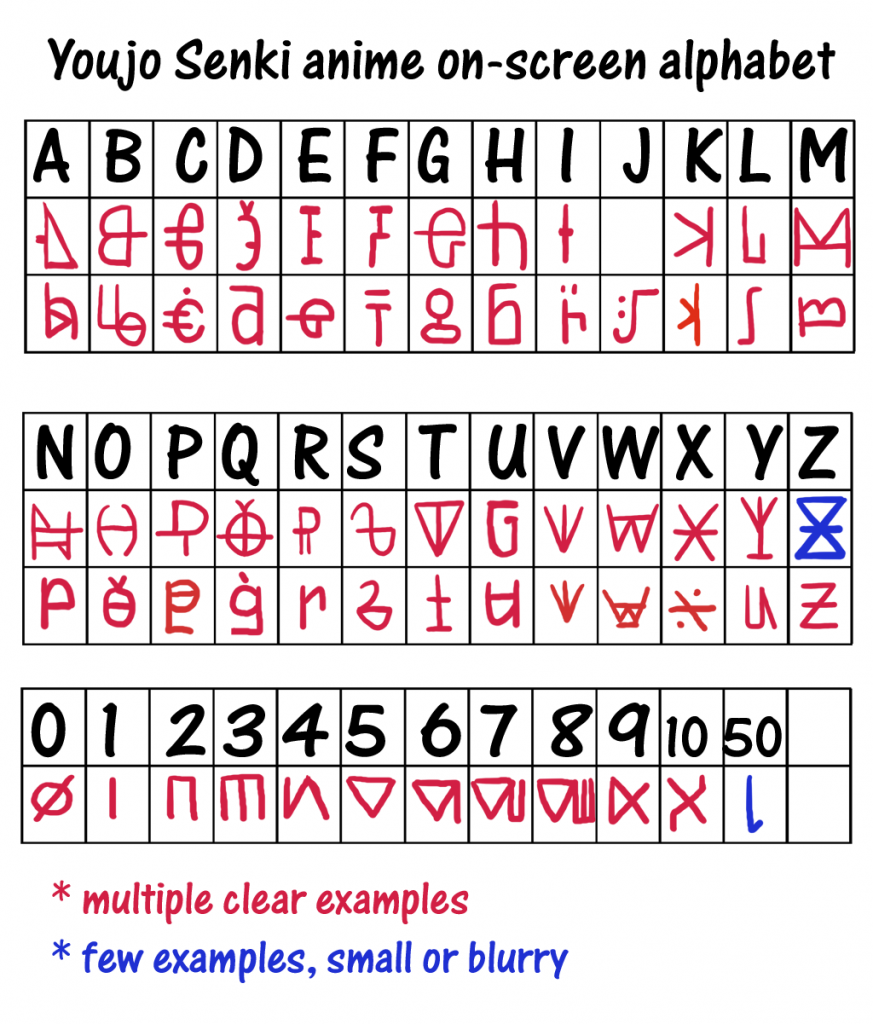
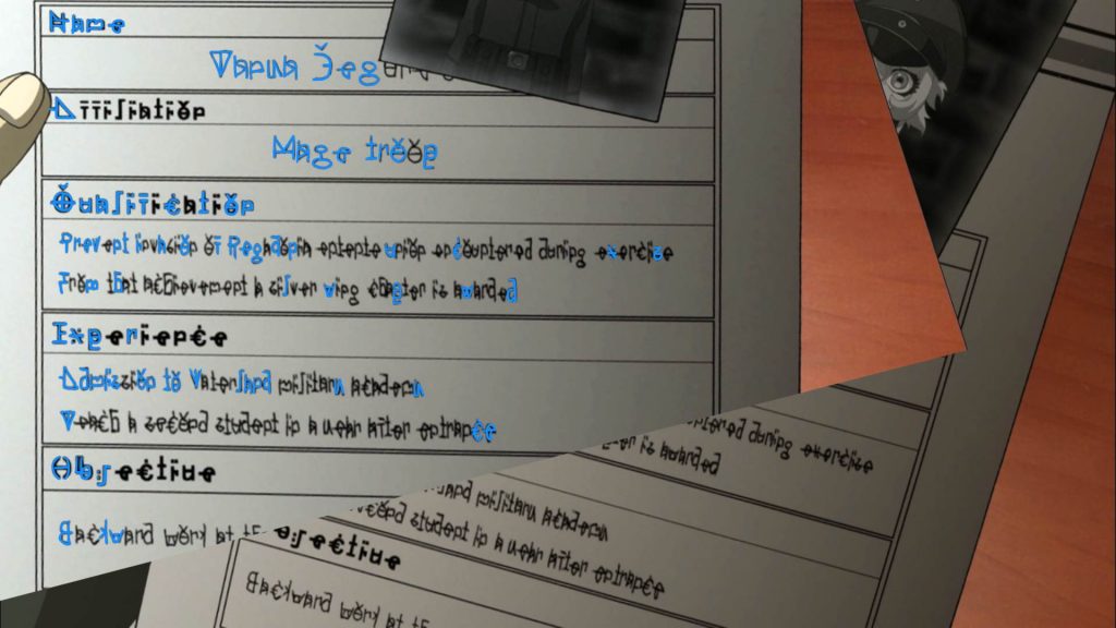
For the print type, there are examples of all letters except J. The Z doesn’t appear on-screen but appears in the art book (we know from the novel that this is restaurant is called Zoruca):

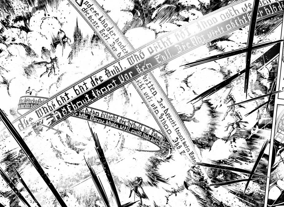
The Fraktur-type misses some more letters:
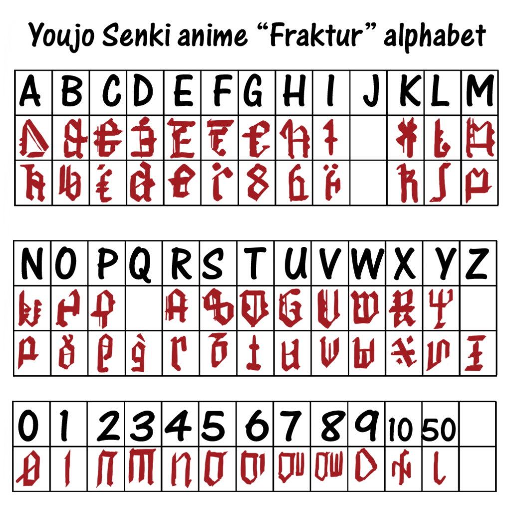
There is no j, J, or Z that I could find. There are 2 instances of Q but too blurry to determine the character with any confidence. Fortunately the manga can be used to fill in some of the blanks.
Still no J though. The manga k differs from the on-screen version but seems to make more sense. Actually the anime has different versions so the one I originally took may have been a blooper.
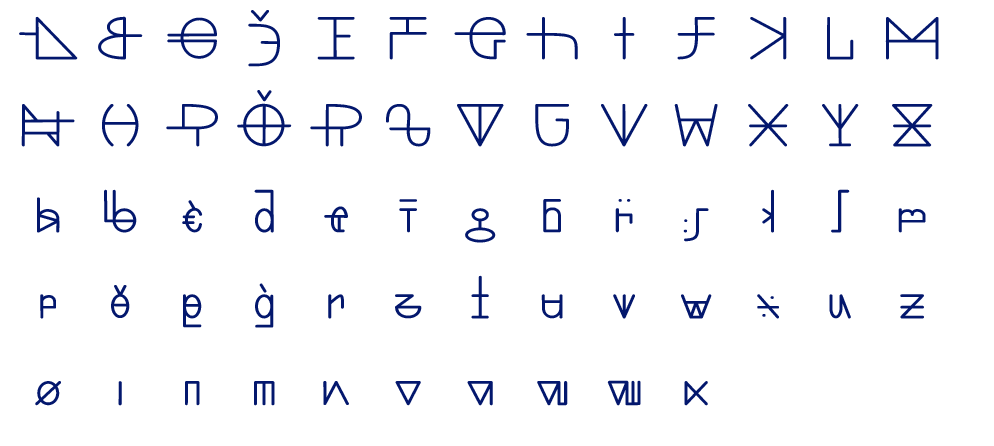
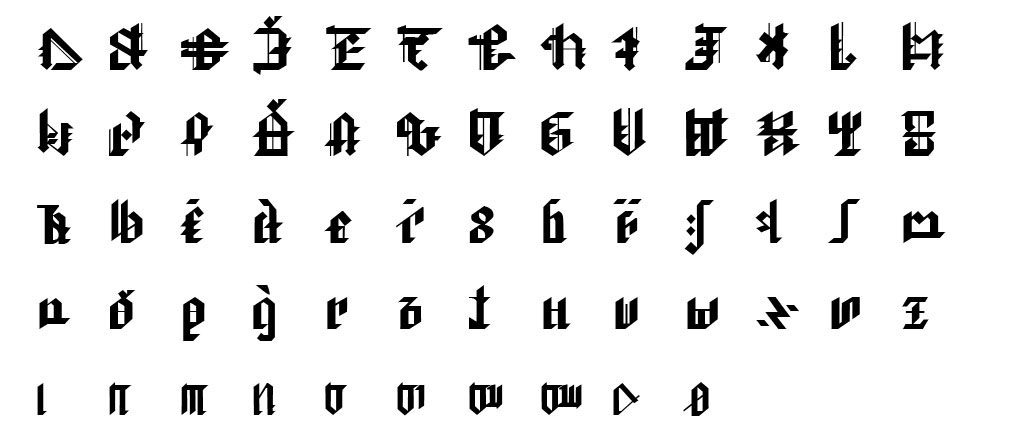
Some people started pestering me to make a font, so I did. For the print type I got most of the alphabet from these sources:

I added a speculative J to complete the font.
The Fraktur type required more disparate sources, so getting the relative proportions right was a lot more work. These are the “best” sources for each character that I could find:
Adjusted to the size and same aspect ratio:
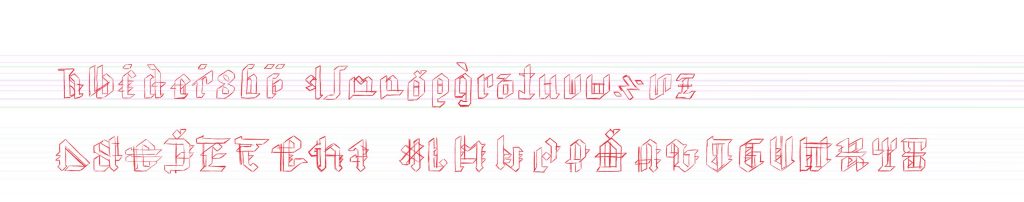
The result, again with some interpolation:
UPDATE:
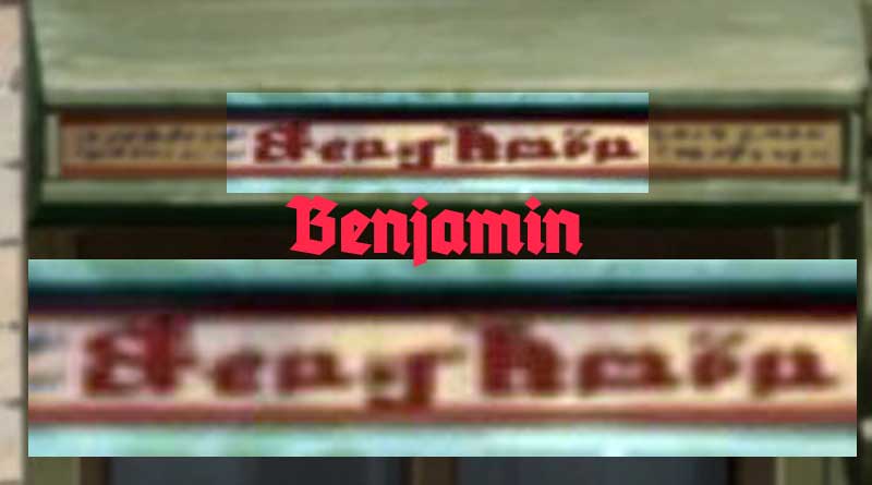
The movie offered some additional information; we got a ‘&’, two ‘J’ and one blurry ‘j’:
So the updated table becomes:
Download the two font files below:
Fraktur style:
- YS_fraktur_wider_whitespace.ttf (first version)
- ysfraktur3.ttf (updated version with movie J and j, also number 10 under ‘+’)
- ysfraktur5.ttf (updated with better x and some punctuation added from Movie Manners)
Print style:
Miralisque from the YS discord helped fix the kerning and spacing, because I know nothing about making fonts.