Preface
When I went went looking for a nice introductory text on perspective drawing that I could recommend to others, I found several excellent descriptions of perspective theory and the techniques involved, yet it seemed something was missing. I had the feeling nearly every writer on the subject wants to clobber the reader with raising a 1, 2, or 3-point perspective from a blueprint as soon as possible. I think that when confronted with the method like this, the amateur artist may well throw up his hands in despair, convinced that he could never apply such a tedious and complicated procedure for every drawing he wishes to make, and may as well give up on the subject altogether as simply too arcane for mere mortals.
My purpose in this little pamphlet is to place things in perspective a little (if you will pardon the pun). I hope you may find it somewhat useful.
The basic questions

First of all, what is drawing? For the moment, let’s say it is a medium of expression, of communicating a message, idea or emotion to the viewer. Unless you only want to draw pretty pictures for their own sake, getting the message across is the primary objective. You do not always NEED perspective to reach this objective, in fact during most of humanity’s history, artists managed just fine without. Sometimes perspective can help you get the message across, and sometimes ignorance of perspective can harm the transmission of your message. Perspective basically helps the artist for three things:
- give a three-dimensional feeling to objects in your drawing
- show were objects are in relation to each other
- establish the viewers’ position and relation with respect to objects in the drawing
With the wonderfully complicated methods of perspective drawing (actually they are not so very complicated, tedious is probably a better description) it is possible to render on paper a very accurate representation of what a 3-D object looks like in reality when viewed from a certain angle. However, for most purposes this is overkill. Unless you are an architect or designer, when you want to draw some guy sitting at a table, you don’t care that your drawing accurately portrays a 60x200x90 table; you’re probably satisfied that your drawing doesn’t make it look as if the table is balancing on one leg. Most drawing is in fact “symbolic representation” rather than meant to be an “illusion of reality”.
In this sense, perspective is a lot like human anatomy to the artist. When you read a comic, you are not particulary disturbed that girls’ legs make up more than half their height and their faces are mostly eyes, but you are probably annoyed when a badly drawn frame shows a character with two legs of different lengths or a different number of fingers on each hand. It’s the same with perspective: you want to avoid mistakes that confuse the viewer and distract from your message, you probably don’t want to fool the viewer into thinking you traced a photograph… So before you start thinking of horizons, vanishing points and all that, the questions are; does this drawing require perspective drawing to deliver my message; if so, what kind of perspective will be the simplest that does the trick; and how do I prevent glaring inconsistencies, given that I don’t intend to make a 3-view plan of my scene to create the perfect perspective?
Pseudo-perspectives
Pseudo-perspectives, also sometimes called parallel perspectives, are not “real” perspectives in that they do not correspond to what objects “really” look like. They are however used quite often by artists, because they are much simpler to construct than the real thing, and work just as well for many purposes. These pseudo-perspectives are also used a lot in technical drawing, mostly because, unlike on a real perspective drawings , you can measure true lengths on them.
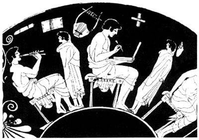
The first “pseudo-perspective”, if it can even be called that, is the humble plan view. Because of its utter simplicity, it is used quite often, mostly when the objects or persons depicted don’t really interact with the scenery (for example,two heads talking to each other, viewed from the side). Such a drawing lacks almost any depth information; in a real plan view you can see what’s in front when two objects overlap, but an object’s size is not diminished by distance. However, most artists will cheat by drawing the background on a different scale than the foreground to give an illusion of depth (otherwise it would be impossible to include the moon, stars, or Fuji-san in a “plan” drawing). I tend to think of this one as the “Greek vase” perspective…
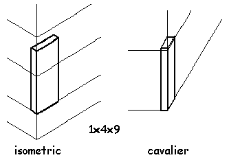
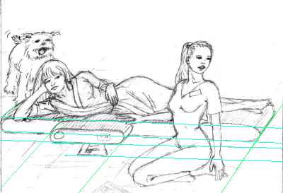
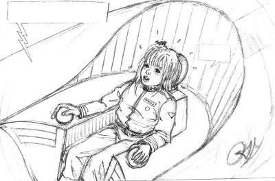
Isometric and Cavalier perspective give a little more 3-dimensional feeling and a more interesting point of view, but you can’t cheat on the background as easily. In isometric perspective, true dimensions are set out on 3 axes; the vertical one and two oblique at 30° (easy to do with a 30-60-90 draughtman’s triangle). An artist is free to use different angles, of course. The main point is that all lines stay parallel instead of converging to a point as in true perspective. In this perspective, too, distant objects remain the same size as near ones. This gives the viewer a feeling of distance from the action, of being an outsider, particularly if the drawing covers a big space with lots of people. Another slightly weird feature is that, if the vertical axis corresponds to “true” vertical, your drawing can’t include the horizon. I tend to think of this as the “Japanese print” perspective.
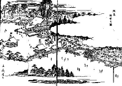
The Japanese prints often include clouds as a cheat to introduce a horizon anyway. Cavalier perspective is similar to isometric, except one axis is horizontal, and another is at 60° (use the triangle again) and lengths along the 60° axis are halved. There are a few more pseudo-perspectives but I never consciously used them and don’t know the details.

True perspective
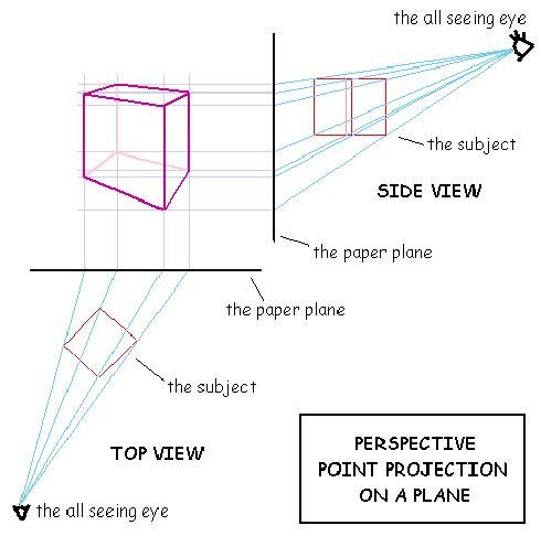
Now we come to the true perspective. The major difference with the pseudo-perspectives (besides the obvious one of being “accurate”), is that real perspective allows you to involve the viewer a lot more. Using real perspective, you can include information about where exactly the viewer is positioned in relation to the subject of the drawing, and even which way he is looking! That is because true perspective is essentially a projection of the subject on the plane of the paper from the viewer’s eye. Distance and height of the eye, and direction of view (orientation of the paper) relative to the subject will all be reflected in the perspective of the drawing. Each of these factors can influence how the viewer reacts to the drawing. If there is no need to involve the viewer in this way, by all means use a pseudo-perspective instead!
Examples
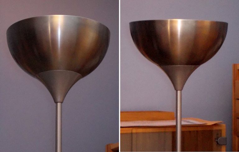
The more perspective distortion, the closer the viewer will feel to the subject. This is similar to the photographic effect of using tele- or panoramic lenses.
By changing the height of the point of view, the viewer can be related -or not- to persons in the drawing.
By tilting the plane, the viewer will feel as if he’s looking up or down. (note: the examples below are all free-hand. I’m lazy…)
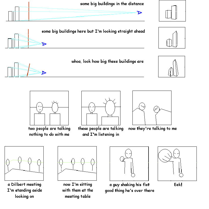
Not having the plane perpendicular horizontally to the main line of sight will give a distorted feeling. Sometimes people do this to avoid using a 2-point perspective but in this case it would probably be better to use a pseudo-perspective…
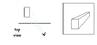
How to construct a true perspective (method we’ll never use)
Vanishing points and stuff
You may have noticed a few things about the method we’ll never use. First, you really need a blueprint of your subject. If the subject is a vast landscape, this may be a little awkward. Second, it is really boring. Third, at no point did we use any horizons or vanishing points. So why does everyone want to use horizons and vanishing points if we don’t really need them?
Because:
- you almost never work from a blueprint. The method is useless for doing freehand sketches.
- if you mess up, the method offers no clue to find out and discuss what went wrong. Your main use of the perspective method will normally be to discover problems in your drawings and to correct them. Saying “your vanishing points are not consistent” is usually a good description of the problem…
Boxes, boxes, boxes
So, if we are not usually going to raise our drawings from blueprints, how do we proceed? This will differ from artist to artist, but the usual procedure is to enclose your subject in a big box, or a Cartesian frame of reference if you will. For convenience sake you will align this box as much as possible with the main “lines” of your subject (if your subject is a house, this is easy. For a sleeping cat it may be less straightforward). Then (if we are using “true” perspective), the point of view and paper plane angle will determine if we need 1, 2 or 3 point perspective. After this, the trick to avoid inconsistencies is to draw everything in relation to the big box. It is usually helpful to partition the box a little. With practice, you will be able to draw mostly freehand, and only occasionally need to refer to the box anymore…
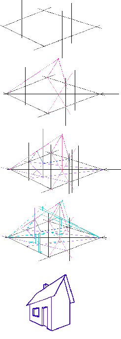
A little example of doodling a house from scratch, with some trial and error and some freehand modification. Because the vanishing points are closely spaced, distortion is rather heavy. Usually you will place the vanishing points further away from each other.
Ignoring perspective
There are a few tricks you can use at times when you don’t want to bother with perspective for one reason or another. The main thing to keep in mind is not to confuse the viewer. The easiest way to accomplish this is to provide as little perspective information as possible. You can, for example, draw only two edges of a table, leaving the other two to the imagination. It is better to leave things out than to include contradictions. Also, if you don’t want to draw something in perspective, be as blatant about it as you can. And by all means be consistent; don’t draw an elaborate one-point tile floor and then draw the furniture in isometric perspective, for example.
In truth, I think the most important thing to get good perspective in drawings is to think about what you are drawing, so you have a clear idea of where everything is in relation to each other and to the viewer. It’s a little more work, but not too much.
Some examples
I went through my pile of sketches to find examples of typical perspectives and also some things to criticize (it seems only fair that I would pick apart my own work). I didn’t create bad drawings on purpose, of course, so there is not much method to this madness…
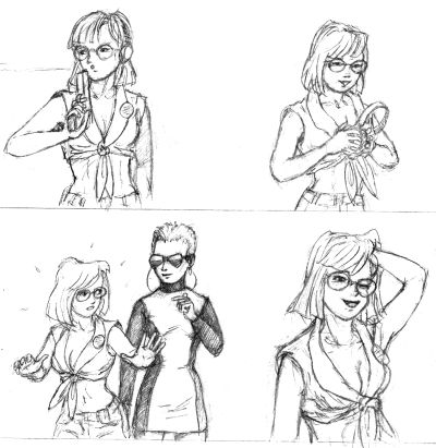
Greek vase perspective
To illustrate the usefulness of this non-perspective, here a series of sketches for what would be an entire comic page, all without any perspective. If I didn’t foreshorten some arms, it could probably have been drawn by an Egyptian…
Japanese print perspective
The following is a cavalier perspective (I marked the axes with color):
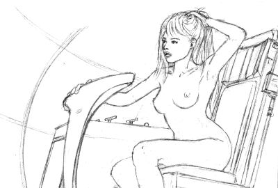
And below is an upside-down cavalier perspective. Really!
The following is an isometric perspective, though it’s a bit hard to see:
One-Point perspective
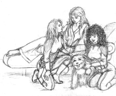
A simple one-point perspective is quite often all that you need:
True perspective
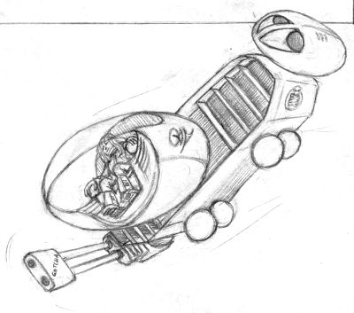
There is no horizon in space! Fortunately two vanishing points always share one line… Something like below is not too hard to construct freehand. The hard part is when you need to draw it again from another angle. But I never actually went so far as to make a blueprint for guidance. I suppose now stuff like this can be rendered in 3D software if accuracy really matters…
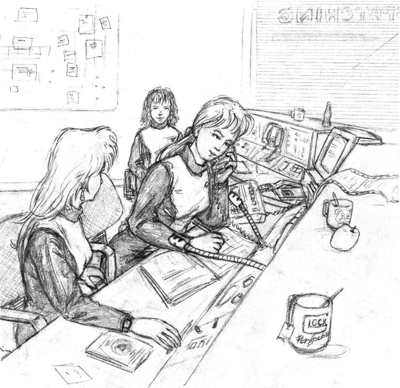
Using photo references are an expedient shortcut:
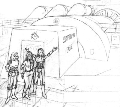
You can also use a reference picture and paste in your characters, but then you must be able to match them to the existing perspective:
On to the mistakes
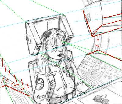
In the cockpit scene below, the blue and green lines are overlaid on lines that were supposed to converge to two points. Corrections in red. The bulkhead hatch should probably be centered behind the pilot, but it isn’t. With determining lines after-the-fact like this, it is hard to be exact so you should not aim for absolute convergence, but big deviations should be corrected.
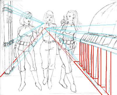
The next drawing screams “perspective exercise”, but the lines don’t converge, and the verticals aren’t vertical. Use a ruler next time, don’t try this freehand! Better yet, leave out all the meaningless details that have to be put in proper perspective but don’t add anything to the drawing.
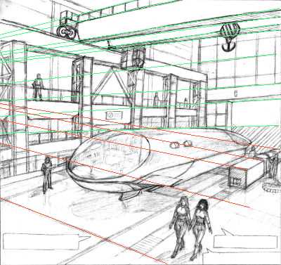
The previous were mostly problems where a few lines were off. A different type of mistake is when some parts of the drawing use a different perspective than other parts. For example, in the drawing below, the top part (green lines) has a different vanishing point than the bottom part (red lines). All that detail would have to be erased… At least this is an example that requires real perspective; a view like this is impossible in pseudo-perspective:
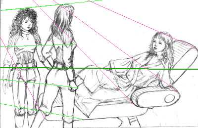
This one has a similar problem; the two characters on the left are in perspective with the eye level approximately at the heavy green line, the right part is a view from above with the eye level well above the top of the drawing. You usually get problems like this when you decide halfway to change the perspective of the drawing but you want to recycle some parts already drawn…
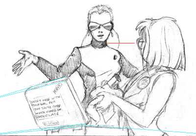
The drawing below shows a typical mistake of using inconsistent perspectives; the guncase is drawn in a 2-point perspective which places the all-seeing eye at a level just below the bottom of the drawing, but the characters are drawn as if viewed from their eye-level. Because of the guncase, it looks like the nearest character is standing in a hole, or the character in the back is standing on a soapbox…
In conclusion

You can deliberately leave out perspective, and if you are blatant enough about it, the viewer will understand that you are using the idiom of symbolic representation. In the first picture below, the potted plant is totally unrealistic, it’s almost the same as just writing “potted plant here” on that spot. Yet the viewer is not confused (at least I hope) because there is no information that contradicts the rest of the drawing.

